

Inspiration
Looking for a painting subject, I searched “endangered species birds winter” in Google images and visited this page
https://www.dw.com/en/germany-endangered-turtle-dove-is-2020-bird-of-the-year/a-50789572
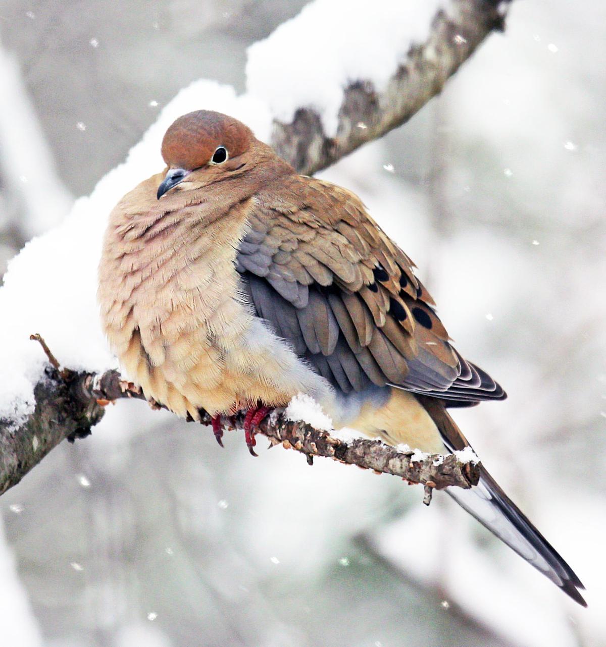
that led me to remember listening to mourning doves. I googled “mourning doves winter” and found this image.
*I SUSPECT THIS IS NOT A MOURNING DOVE, but I like this bird because of the way its feathers are fluffed and the variations in color.
Challenges:
- tans/beige are difficult.
- “Portrait” orientation needs to be adjusted.
Inspiration videos:
Creation
Session 1
The first two sketches were too distorted, as I struggled to change portrait orientation to landscape. The little bird keeps getting stretched horizontally. My third try was still a little wonky, but I started to paint. I painted some background gray, trying to keep things as wet and loose as I can, which is so
I painted some background gray, trying to keep things as wet and loose as I can, which is somewhat difficult as I must paint with an angled easel in order to reach paper and paint. In retrospect, gray makes a dead background and I wish I had used some blues instead. I added some pink on top of the gray…
Yowza! That’s where things went horribly wrong. I pulled what I thought was a light orange and it turned out to be a bright yellow. There aren’t any tans on my palettes. So I threw caution to the winds and did some underpainting with blue and orange.
Sessions 2 and 3: I started over. New sketch and this time I found a paint tray with some tans. When it came time to paint the feathers on the right side of the body, I used black to outline feathers and put patches of black on some of the feathers that were underneath I did not like that at all!
sessions 4 and 5: I started over. New sketch. I painted a pink and blue background, edited out the branch behind the bird’s body. I tried to make the brushstrokes indicate feathers. On the right side of the birds’s body, magic happened. When I looked at the results of session 4, I liked the blue paint strokes that were produced by putting on full strength blue and then wiping it off with a wet brush. Letting go of the attachment to realism, I added browns and blues to the bird’s back using the same technique. I really like this little bird, even though it doesn’t look much like a mourning dove.
Insights:
- if at first you don’t succeed, try, try again. After the first attempt, I was sad and angry, but I felt the feelings and persisted. I’m glad I did.
- I would like to make this into a style. I’m not sure I can, but I am excited to try!
- Releasing realism was very helpful.
- I am not crazy about the background. Three problems: pink was not the right color. It clashes with the orange of the bird’s head. 2) Seeking to brighten the background, I added another layer at the end and you can tell the background went on over the foreground. I need to work on both alternately. 3) If I’m going to “fade out” the edges, I need to wet the paper as I go. I let the paint dry too much before “fading it.”
- Checking in on my goals:
- escape photo’s composition: yes. Having the simpler background made the painting less appropriate for mining snippets, though.
- Emphasize what attracts me to the image: sort of. It was the “cold bird” feathers that attracted me.
- Get better at portraying depth: not sure.
- Not overwork the paint. In a way, the new technique IS overworking it, but in a good way. The background problem is due to overworking in a bad way.
- Have a looser style… And ANY style. Huge progress here. Celebrate!